15 stunning living room colour schemes & combinations you'll love
From classic and timeless to bold and statement-making, discover the best living room colour combinations with this guide.
When it comes to the home, it can’t be denied that colour matters. For a multi-functional space like the living room, the colour scheme needs to fit with your lifestyle and also remain timeless, which can feel tricky.
As the central spot in the home, the living room should be a space where everyone feels comfortable and also reflects the personality of those who live there. This can be with a relaxing neutral colour scheme or a strong accent colour that makes a statement.
From timeless colour palettes to unexpectedly bold options, discover the many ways you can inject colour into your space with these living room colour schemes.
How to choose your colour palette
When choosing a colour palette for your living room, here are a few tips to consider when starting. Amanda Bailey-Rook, Senior Stylist & Creative Coordinator at Furniture And Choice has weighs in:
1. Think about how you want the room to make you feel
Do you want the room to make you feel calm and relaxed? Or joyful and energetic?
Colour psychology plays a big part in our emotions so take these factors into account. Muted, earthy tones make a space feel relaxing and calming, while more vibrant colours will make the room feel more energetic. The colours we like are very personal. If you are unsure what colours you like, look at the clothes you wear. Think about the colours of your favourite outfits and how you feel when you wear them.
2. Take into account the living room finishes
Is your flooring wood or carpet? If you are keeping existing furniture or buying new furniture, think about what colours your sofa, coffee table, TV stand, or bookshelf.
3. How dark or light your living room is
Does your living room receive a lot of natural light or get quite dark? If your room is already dark, then adding any darker colours, especially to the walls, will make it feel even darker and possibly even make the room feel smaller.
The direction of the living room determines how much natural light it receives. North-facing rooms are cooler and receive less natural light while south-facing rooms receive a lot of natural light. East and west-facing rooms depend on the time of day, so this will allow you to decide what wall colour is the best.
4. Create a moodboard
This is a great way to see what will work together and get a sense of what works well and what doesn’t. Get paint swatch cards or request them online to compare. The textures you choose are also important - add in your sofa fabric swatch, wooden flooring or carpet swatch to see. You can also include things like a statement cushion cover or a photo of a piece of artwork that you’re thinking of using.
5. Follow the 60/30/10 colour rule
A good way of breaking down the room is the 60/30/10 rule. 60% is the wall colour of choice 30% is your furniture in the room, sofa, rug, coffee table, etc 10% is the smaller touches and accent colours that are on a cushion, throw or candle.
(Credit: Furniture And Choice )
Amanda Bailey-Rook
Senior Stylist & Creative Coordinator at Furniture And Choice
Amanda has been an in-house stylist at Furniture And Choice for over six years now. She has gained experience over the years by starting out her career in women's lingerie, children's wear and interiors, then as a freelance stylist for many different companies.
Her absolute passion is with interiors and interior design. She wholeheartedly loves creating rooms that inspire and bring joy to people.
Simple, understated and sophisticated – that’s how you can set the mood with a neutral palette. If white feels cold and uninviting, there are plenty of cream, off-white or beige tones to work with.
Whether it’s classic or contemporary décor, neutrals provide the base for wall colours, sofa upholstery options, and the type of natural materials to use. An important consideration is the types of textures you will be using. To prevent the room from looking one-dimensional, create contrast between the sofas and the flooring or bring in other accents in grey or black to build a neutral-on-neutrals look.
Green is a colour that’s known to evoke feelings of peace and calm, which makes it one of the top living room colour picks. If your living room gets lots of natural light, choose a light shade of green so that it easily reflects the sunlight. This can be sage green, pastel green or mint which will refresh and soothe your space. Thanks to green’s association with nature, bring in lots of wooden accents to match the calming vibe of your space. This can be through furniture or flooring to complete the look.
Want to shake things up in the living room? Think pink. Although there are plenty of pink hues to choose from, such as Barbie pink and hot pink, mauve pink is probably the best option for the walls. It is soft yet vibrant, and has all the fun qualities that come to mind when you think of pink. Mauve pink is also a great medium for anyone looking for a pink tone that’s between blush pink and fuchsia. For a pink living room that’s sophisticated and classy, pair mauve pink with neutral colours like cream and beige and contrast with gold accents.
Colour drenching is an interior design term where you paint everything the same colour – from the walls, wall panelling, ceiling, and skirting boards to the radiator. Inject optimism and joy with yellow walls to uplift the room and bring a fresh feeling to your space.
Complement the yellow walls with mustard or burnt orange upholstery. Pick lots of cosy textures like velvet or plush fabric for sofa upholstery and a shaggy rug to soften the space.
Brown is trending now and is the perfect way to introduce an earthy colour palette to the living room. Choose muted tones like beige, camel or latte on the walls for a luxe feel. This light base makes it easy to bring in dark brown tones as accents. You can do this by highlighting parts of the room, like painting an alcove dark brown or furniture like a coffee or side table.
If you want to add other pops of colour, choose complementary earth tones to enhance the look. Green is an easy pick, providing a stylish accent while still keeping to the earthy palette. Your choice of textures are also key in nailing this look - go for dark woods, cosy fabrics and indoor greenery to liven up your space.
Jewel tones are commonly associated with luxury, sophistication and elegance. Burgundy has started to trend once again and is here to heat things up. As a colour, burgundy brings a sense of grandeur to a space, thanks to its deep reddish hues. Even though it used to have more of a vintage feel thanks to its regal associations, burgundy takes on a more contemporary approach with this new update.
If your room has wall panelling, the burgundy tone will emphasise these details and elevate your room. With its deep undertone, it goes well with a burnt orange tone and stirs feelings of passion and comfort with textures like velvet or plush fabric.
Sometimes the best colour combinations can be created by just mixing and matching the same colour in different tones. For example, if you’ve chosen a deep blue tone for your sofa, go for a lighter blue tone on your walls. This creates a layered look and makes the space feel super cosy.
Mix and match different blue tones throughout the room with cushions, rugs and accessories like throws. Deep and darker tones of blue, when paired with textures like velvet or plush fabric will warm up the room, especially when it’s winter.
Purple was once thought of as dated, but when done right, it can feel cosy and contemporary. As a living room colour, it’s a unique choice as it can be used to lighten up or darken a space, depending on the tone you choose. If you want to lighten up the room, choose a purple hue like lavender or lilac. Darker tones like plum or eggplant add a sense of depth, making the room feel warm and comforting.
Deep purple tones go well with metallic accents like brass and gold. If you’re looking for a colour to ground your living room, choose brown as it’s a warm tone, while grey tones tend to make the room feel cooler.
9. Brighten a grey living room with playful pastels
Grey living rooms sometimes get a bad rap for being the ‘safe and boring’ choice. However, that doesn’t have to be the case; it’s an incredibly versatile colour that serves as the perfect canvas for pairing with other colours, and it goes well with any interior design.
Bring a playful charm to your grey living room with pastel accents. Use warm hues like mustard yellow, blush pink, or sunset orange to contrast against cool-toned greys. Introduce these vibrant colours through cushions, accessories, artwork, and even fresh flowers. You can mix and match different colour combinations as long as the colours have the same warm undertones.
A monochrome colour palette is always a good idea if you love timeless and elegant décor. For subtle depth, you can create a layered look with a cream sofa and off-white walls. Choosing cosy fabrics will help highlight the subtle contrast between white and cream if you’re using both tones.
Use black to highlight specific parts of the room, whether with a feature wall, art, or even with a statement sofa. This works beautifully in a monochrome space since black and white (or cream and beige) are one of the undisputed true pairings in the design world, creating immediate visual (chic) contrast.
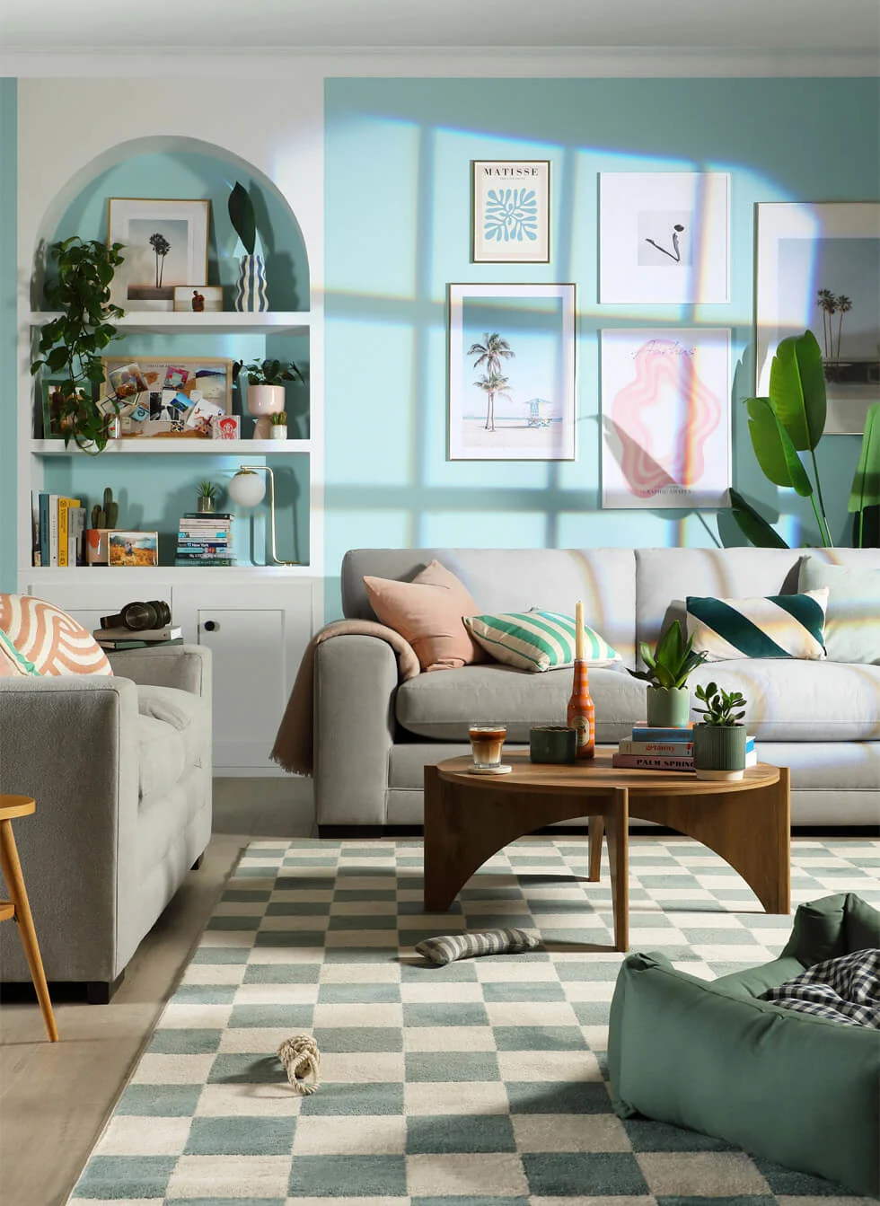
If California’s sunny climate is on your mind, Palm Springs décor and colour palette may be just up your alley. This style is known for open plan style design, indoor-outdoor connections and contemporary lines and sunny colour palette. For this décor style, sky blue is your best pick for a wall colour.
The key element is to make the most of your natural lighting. The sunshine streaming into your home is the magic ingredient to make it feel like you’re on the set of Selling Sunset. Pastel accessories in light pinks, peach tones, alongside crisp whites and cool greys will accentuate this sunny look.
If you want to keep your walls white but add pops of colour, millennial pink makes for a chic and uplifting accent. This dusty rose pink hue, which was popular in the mid-2010s, promises joy and light-hearted fun.
Choose millennial pink as the sofa colour pick for a stylish focal point for this two colour combination for the living room. The white walls serve as an easy base to decorate, so bring in other pink accents through artwork or accessories. This colour combination is also a great excuse to perk up your room with fresh flowers (in pink of course!).
If you’re all about making a statement, pairing a black sofa with black walls is a pretty avant-garde risk. This living room colour scheme is a great idea if you regularly have film nights at home. Choose textured wallpaper and contrast it with a black leather sofa and accessorise it with a cosy throw or two. You can bring in metallic accents like chrome or brass accessories to lighten up the room or soften the space with a rug.
Pastels bring a sense of fun and positivity to a space. If you’re having trouble choosing just one colour, why not pair two or three pastels together? Choose a primary colour, we recommend peach tones since they are a good medium between soft pinks and light blue and green pastel tones.
Since you’re decorating with pastels, it’s best to pair them with furniture in darker colours like wood tones or greys to balance the room. Soft fabrics like cotton make the room feel cosy while still maintaining that light and airy feel.
15. Use green as an accent in a neutral colour scheme
Green is an incredibly versatile colour thanks to its natural connections and can be used as the primary colour or as an accent, depending on how you decorate.
If you want to inject colour into a neutral living room, choose forest green accents as a stylish contrast. This can be with a green fabric sofa or by adding lots of green accents through accessories like cushions or throws. Its deep green hues stylishly contrast with light wooden textures and feel right at home if you have indoor foliage.
FAQs
What colour is the best for a living room?
Think about a colour that suits your lifestyle and personality the most. If you’re having trouble deciding, think about the colours you regularly wear or what appears most in your closet.
Which two-colour combination is best for a living room?
Blue and white is a timeless pick for the living room. Dark blues like navy ground the room while white lightens up the space.
What is the latest trend in living room colour?
The latest trends suggest that more people are experimenting with colour. This can be with bold accent colours or the colour drenching method where the whole room is in one colour. More people are experimenting with colours like burgundy, burnt orange or yellow.
Is pink a good colour for a living room?
Yes, pink is a good colour for a living room. Even though it may feel too feminine for some people, it is an incredibly versatile colour that goes well with other colours. It pairs easily with white, pastel tones like peach, mint green and sky blues.
We hope you enjoyed reading our colour scheme for living room ideas. Looking for more living room décor ideas? Read our blue and grey living room ideas guide.


