A seriously misunderstood colour, pink is really what you make of it.
By turns, it can be comforting, vibrant, soft, modern, vintage, even fierce. But above all, it’s deeply wearable, and in 2017, it has finally shaken off the trappings of being only for girly girls, and really come into its own as a thoroughly stylish colour for the home.
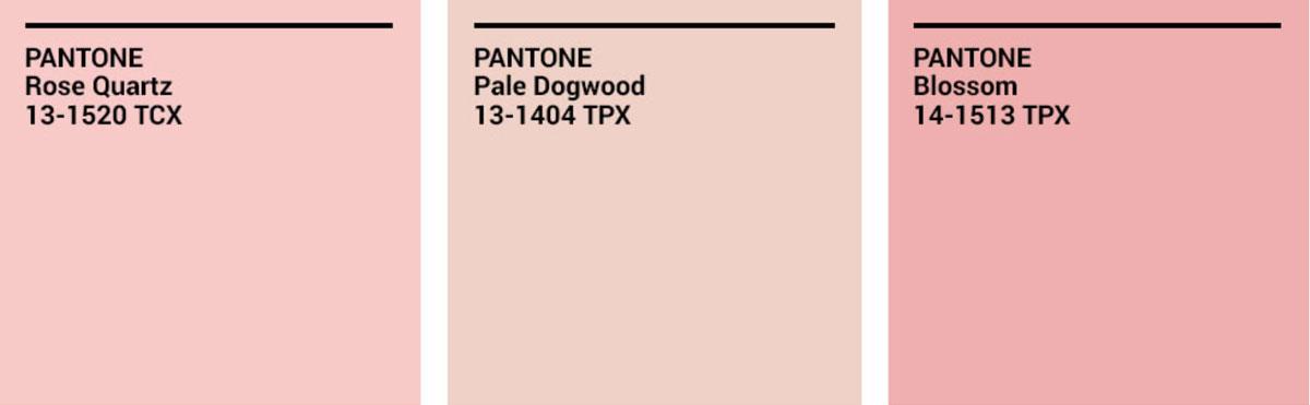
Pink hit the radar in a big way when Pantone declared that Rose Quartz was Colour of the Year for 2016 (along with its soft blue counterpart, Serenity), but its slow rise has seen it make its way into the clothes we wear, the advertising we see, the products we buy, and now the homes we live in.
So if you’re ready to test the waters with this colour - let’s get going!
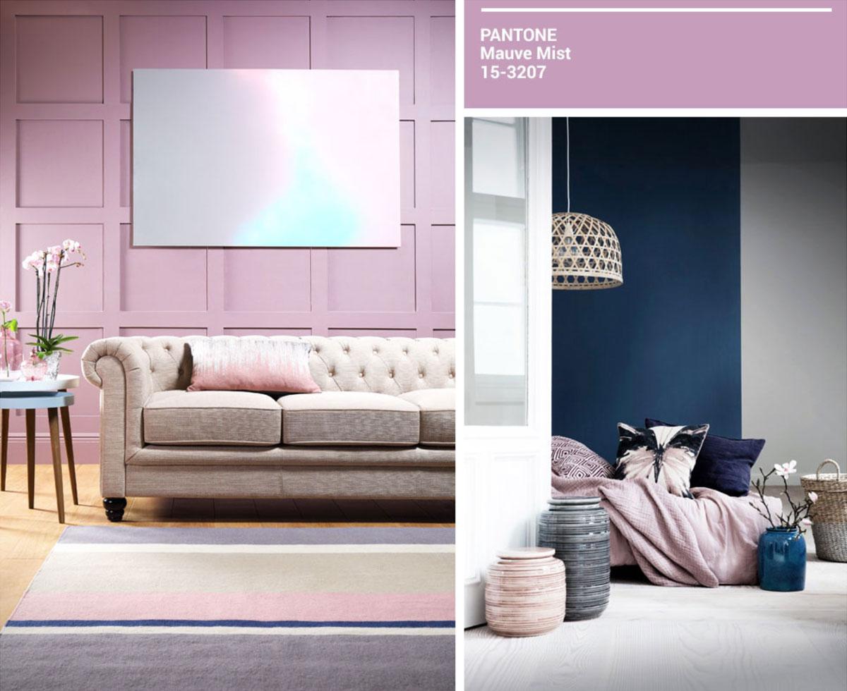
For the colour-shy, mauve is a wonderful starter pink - not overly loud, but still a distinct colour with its own personality.
Pink with a cool, purple tone, mauve serves as a calm backdrop against which other colours can shine. A taupe or beige sofa against a mauve wall has the same soft appeal as a neutral room dressed in grey and soft white (also good friends of mauve), but with an added dose of style and fun. Its understated quality also lends a classic feel to rooms, making it a great choice for homes with panelled walls or vintage, period sensibilities.
Darker jewel tones such as deep navy and purple would also play well against this shade, as it offsets their rich, strong tones.
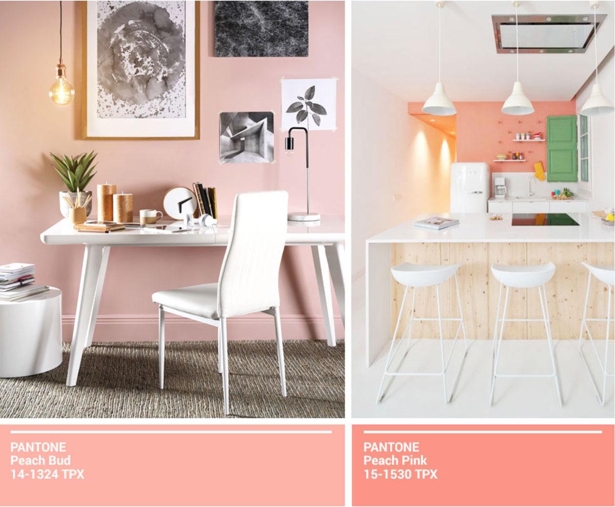
If happiness were distilled into a colour, odds are good that it would look something like a bright peachy pink.
It’s a perfect way to get a summery, cheerful punch of colour into a room, without being obnoxious. Paired with glossy white tables and chairs, this shade creates a fun, vibrant space that wouldn’t fail to get a smile or two, whether in use in the kitchen, dining, or living room.
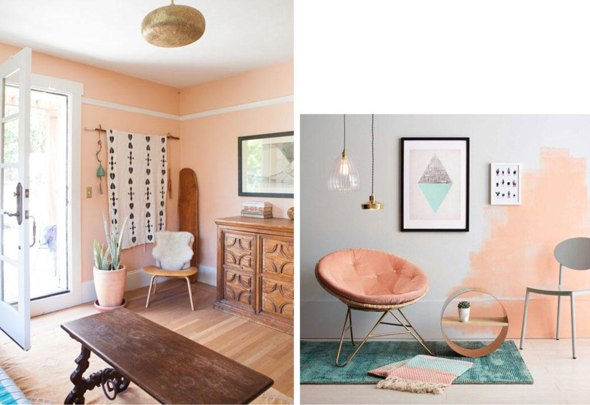
For a touch of gravitas, natural wooden tones can help to ground the room while still giving your space a warm, natural feel. This combination also evokes the desert, with its shades of peachy teracotta (For more on the think-pink trend, we’ve got you covered here) and brown, giving a sense of adventure and verve.
Gilded accents also look beautiful alongside this shade of pink, with copper tones particularly standing out. Consider adding lamps, or a vase, for a modern, fresh approach.
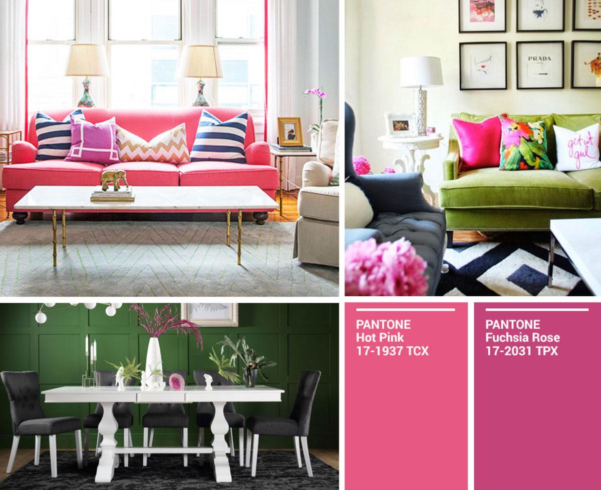
If you tire of neutrals easily and love bright pops of colour, hot pink is the one for you. Whether in a pink that is bright with a whitened undertone, or in a stunning fuchsia, it’s an attention-grabber.
That said, this is an undeniably loud and unabashed colour. And so it’s most wisely used in strategic doses: while a pink sofa or table would make a strong centrepiece, here it’s really the pink piping in the room that pulls it together.
Hot pink also pairs off well against green, whether in a darker, forest shade or the yellowy tones of chartreuse, as well as white, for a lighter touch.
Another smart way to get the fun of hot pink without the commitment is to incorporate it in elements that can be moved around: throw pillows, art, rugs, and little odds and ends.
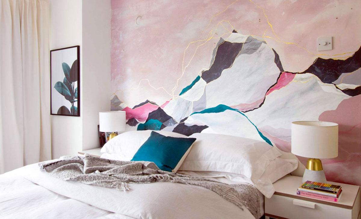
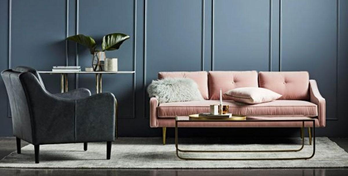
But don’t let the name put you off: soft, comforting and dreamy, this iteration of pink has beige undertones that keep it from the sweeter side of the spectrum. As such, it easily takes the place of neutrals such as cream or white, and can be used in a bigger way.
In soft washes, blush pink creates a relaxing, stylish space and is a great canvas for darker colours such as grey and even teal.
And here those same principles are applied in reverse, with blush pink adding personality and levity to an elegant space filled with darker, more sober colours.
With so many options, shades and textures, incorporating pink into your home is only a matter of imagination and opening yourself up to its (rather exciting!) style possibilities.