Find out more about Pantone's feature colour of the year and how to work it into your home.
It’s a colour that’s supposed to be easy on the eyes and spirit, but for the aspiring interior decorator, green might represent something rather different: a challenge, if you will.
This is especially true for Pantone’s Colour of 2017: Greenery. It isn’t just green, but green with a bright, zesty yellow tone thrown in, evoking nature and newness.
As Pantone puts it:
"Greenery… evokes the first days of spring when nature's greens revive, restore and renew. Illustrative of flourishing foliage and the lushness of the great outdoors, the fortifying attributes of Greenery signals consumers to take a deep breath, oxygenate and reinvigorate."
So while green may be appearing in splashes on runways, but how does it translate to your home? Well, as it happens: with great versatility.
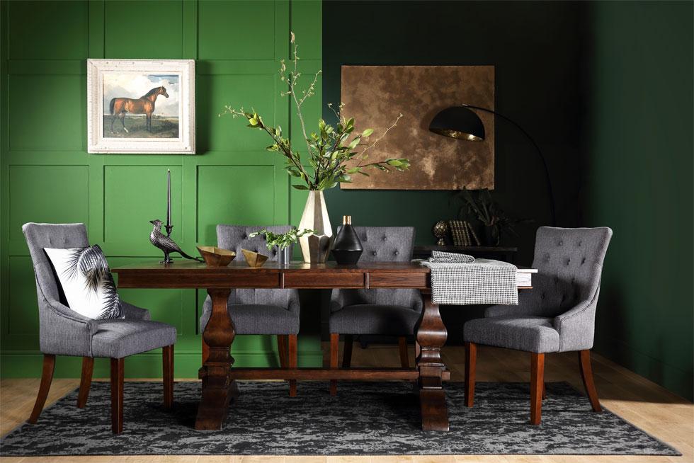
While Greenery may be all about spring flowers and foliage, green can be more than that. And a darker, moodier shade of green is certainly more wearable while retaining some verve.
Speaking of intrigue, using a dark forest green as a backdrop serves up a delightful air of mystery. Gently accent your room with golden tones set against this leafy green for a touch of barely-there sparkle. For a fresh contrast, glossy white furniture and decor really shine against this darker tone, evoking a summery look that can be switched up with shades of grey and taupe as the seasons change.
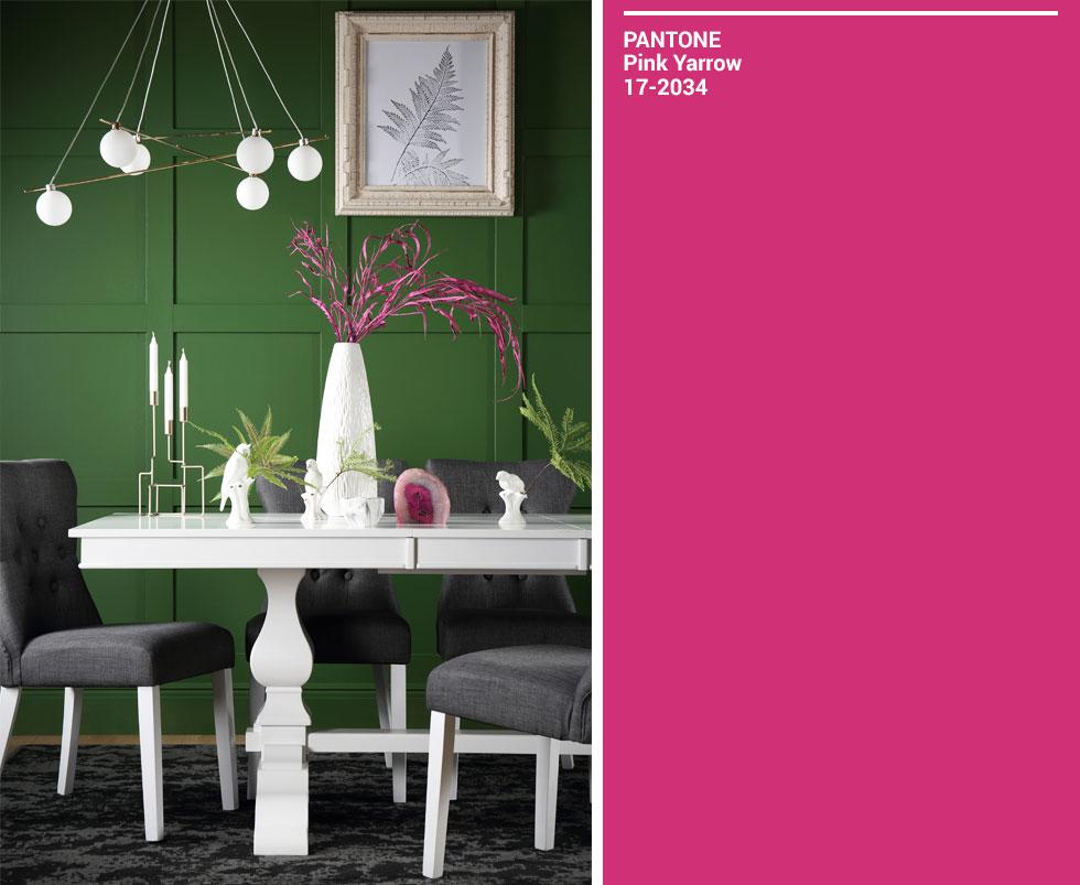
Other colours play well with green too, and this is our favourite. Absolutely announcing tropical joy, dashes of pink or magenta are a wonderful, vibrant way to lift spirits and provide colourful focal points against a green backdrop. Consider the loveliness of bougainvillea and dahlias, for example. Best used sparingly, this is a playful pairing that delights in the unexpected.
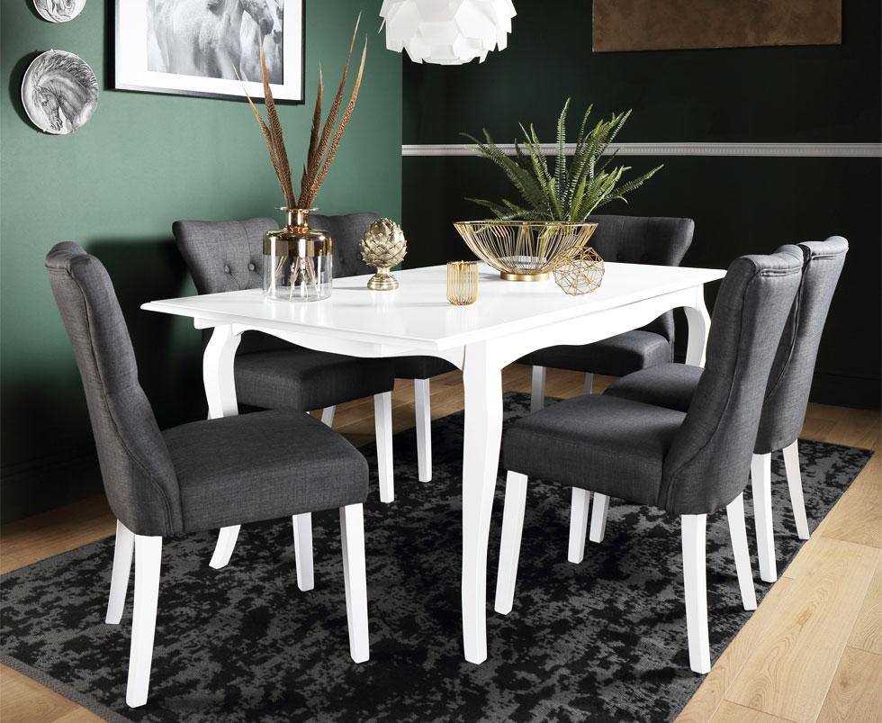
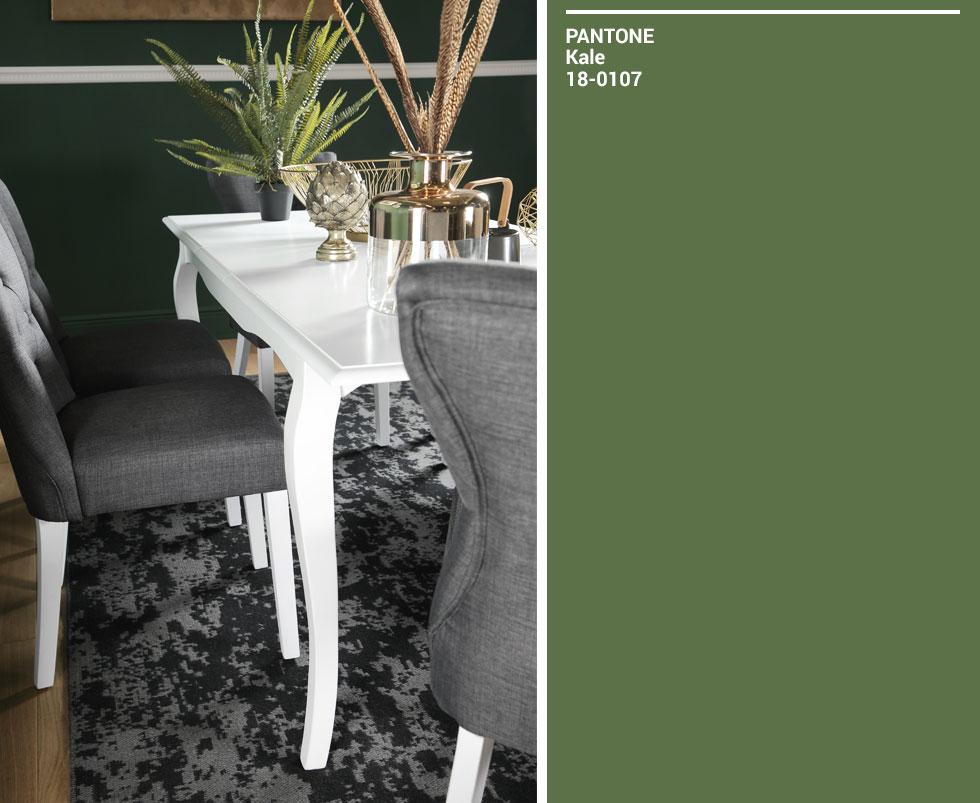
While Greenery can be a little intimidating, another shade from Pantone’s palette of 2017 is less interested in standing out: Kale. Still evoking natural, foliage-based tones, Kale has a softer, lusher feel - ideal for complementing other shades of green without being in competition, while still adding a distinct, verdant flavour to the home.
So there you have it. While Greenery may be the colour of the year for Pantone (and you’ll certainly be seeing its sunny, yellow-based tones in the clothes we wear and the mugs we drink from), there are other ways in which you can play with this colour trend and make it your own.
The right shade of green is just waiting for you - so take a spin on the colour wheel and see where you land.