At its core, a pastel colour is any shade with just enough white mixed in to become a paler, softer version of itself. And while you lose saturation, you don’t lose impact -- just look at the overwhelming popularity of millennial pink!
Making these adjustments to a hue can really change the effect it has. In colour psychology, pastels are associated with being soothing and gentle, even somewhat sweet. For instance, while orange might have an energising, exciting feel, a soft peach can be friendly, calm and positive.
This spring, zesty pastels bring together the best of both worlds - with brighter, bolder pastels coming to the fore, balanced out with soft white tones and creamy neutral palettes.
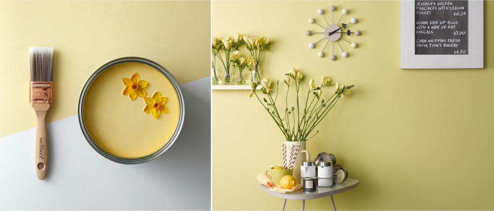
“Reminiscent of sunny days, yellow-based colours will bring warmth to any corner of your home, especially kitchens and hallways,” Emily advises. “Lemon yellows like Jemima or Daisy Chain are sure to add joy to any colour scheme.”
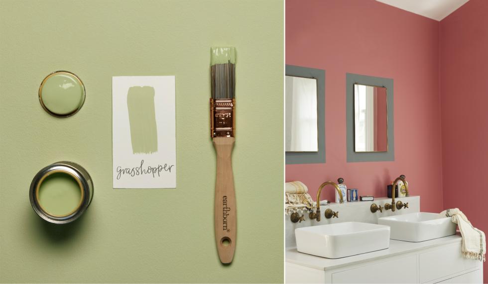
We know yellow might not be for everyone though! “If yellow’s not your thing, choose colours with a yellow undertone instead,” Emily adds. “These include Delilah, a coral-based pink, Grasshopper, a cheerful spring-green and Milk Jug, a mellow turquoise.”
Emily also dispels a common myth about eco paints and bright tones. “Contrary to the notion that eco paints might be wishy-washy, there are a number of zingy shades in the Earthborn palette!” she says. “From the bold sunshine yellow of Daisy Chain, which is a perfect match to Pantone’s Colour of the Year, to the tropical blue tones of The Lido, all the way through to our zingier pastel shades.”
Read on to find out how to incorporate these vivid pastels into your home for a truly fresh and lively space.
Start with small pops and accessories - cushions and throws are a great option here, especially since you can move them around until you achieve a combination and look you’re happy with. The key is to use pastel shades intentionally to give life and freshness to your room.
2. Experiment with pastel prints and colour blocking
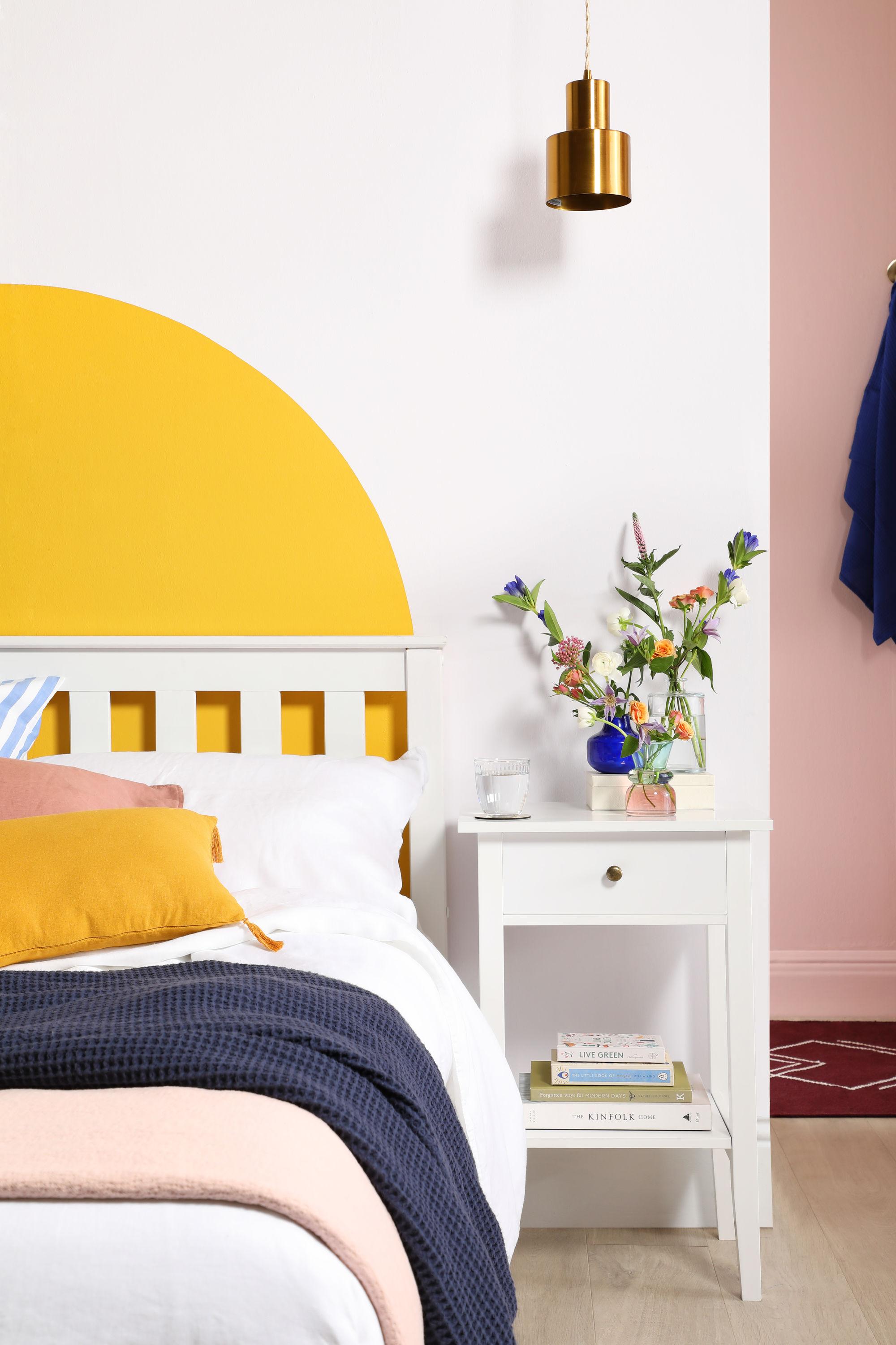
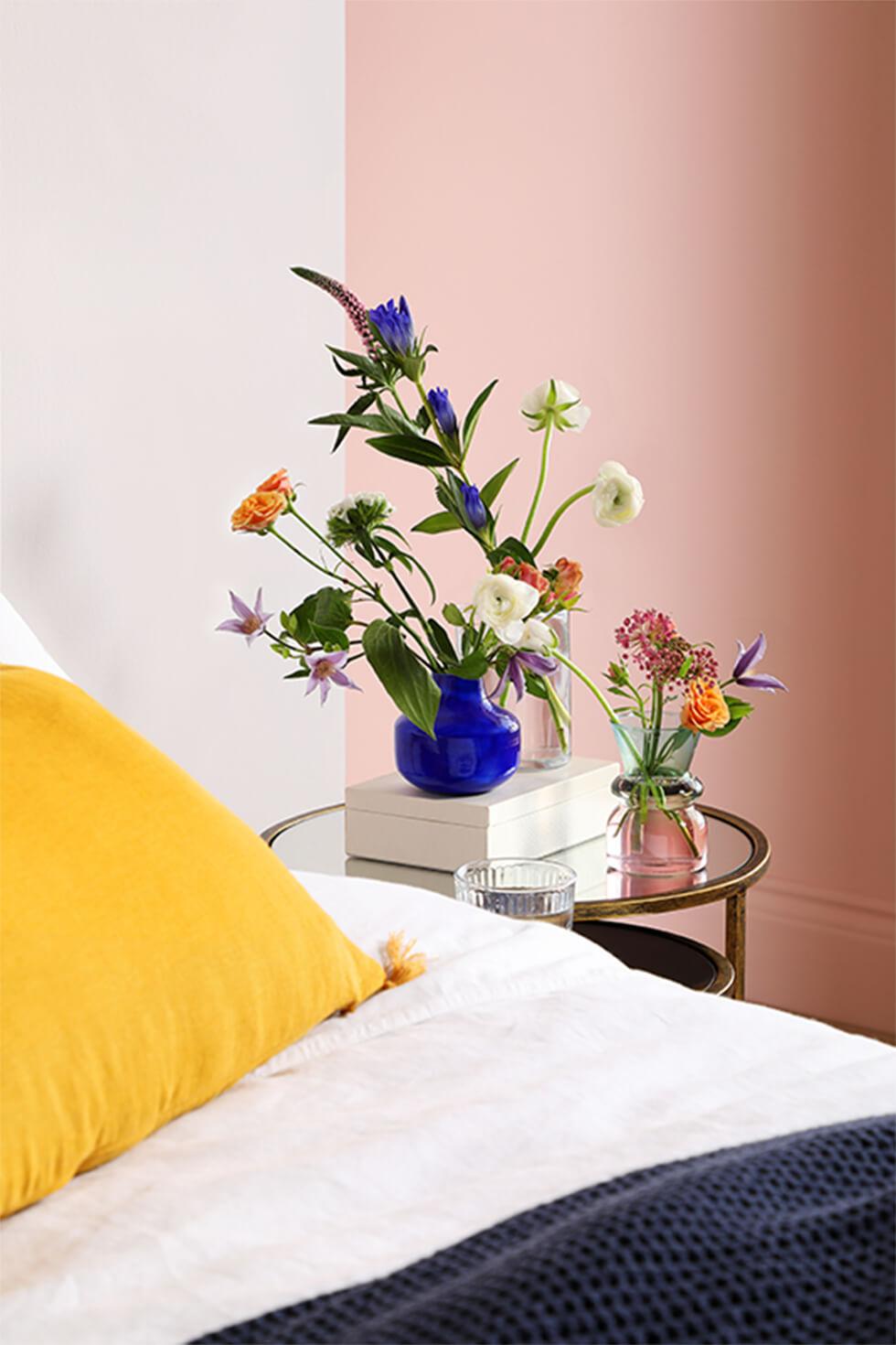
If you’re ready to try out a larger piece, work in some prints and wallpaper - or better yet, opt for a DIY colour block statement! In this chic bedroom, a pink pastel wall lends warmth and style (played up with matching pillows), while still allowing the star of the room to be the painted yellow ‘headboard’ on the wall.
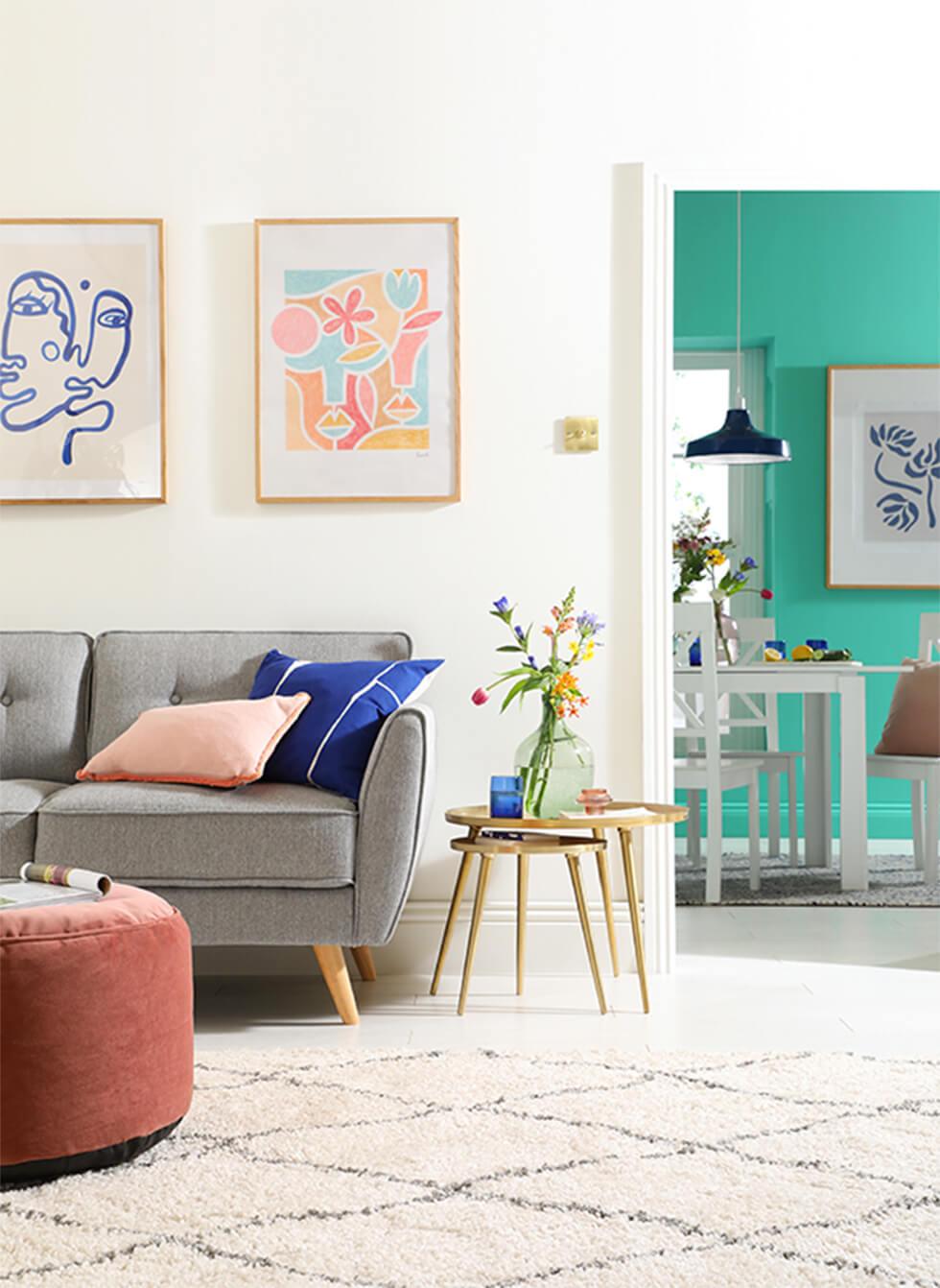
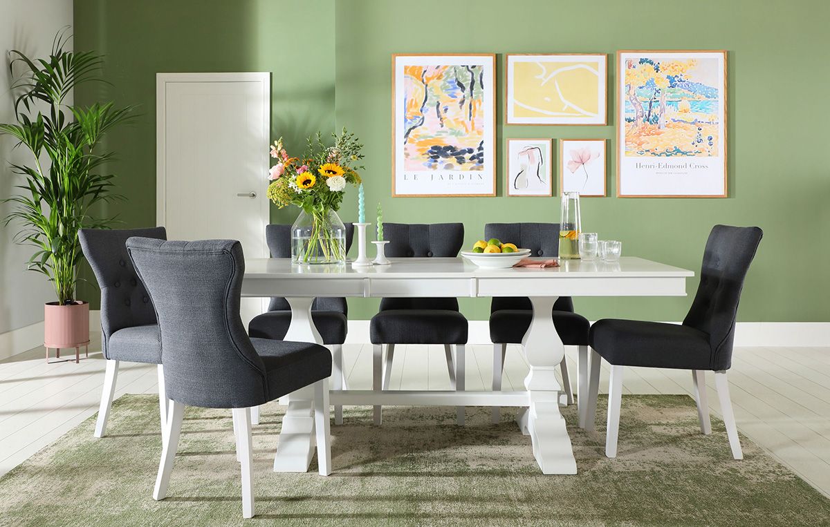
Mix and match pastel walls with a classic furniture set for a timeless feel. For example, style a white dining set with meadowy green walls in the dining room to set the scene for entertaining. Energise the room with pops of light yellow and blue to bring out that zesty effect.
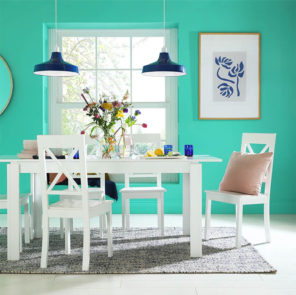
Pastels are a good entry point when working with a lot of colour, since they’re easier on the eye than stronger shades and have a more restful quality. This airy, cheerful turquoise dining room has tonal accents with the dark blue pendant lamps and glassware, while a white dining set serves as a stylish, clean anchor.
5. Play with different pastel colours for contrast
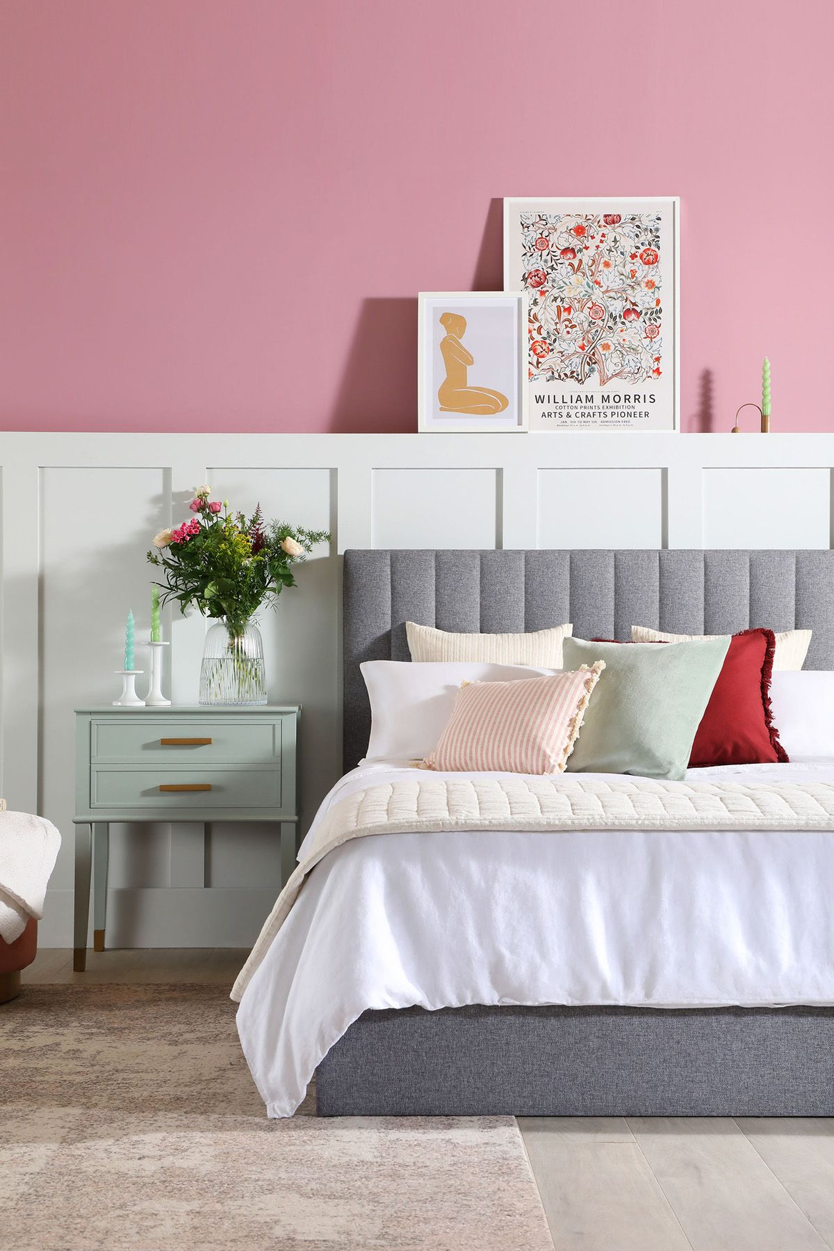
Pastels offer you even more opportunity to work in different colours, thanks to their gentle nature. So mix and match to see what works! Think of shades that are on opposite ends of the colour wheel: for instance, pink and grey make a light and contemporary combination.
Create a cosy blush haven in the bedroom with desert pink walls and a grey fabric bed. Make the space that extra bit sweeter with scatter cushions and colourful artwork.
Lastly, since this palette is inspired by spring, bring some of that vibrance and life indoors! Natural bright pastel tones simply can’t be beaten, especially with the pinks and purples of hyacinths and crocuses, and sunny marigold.