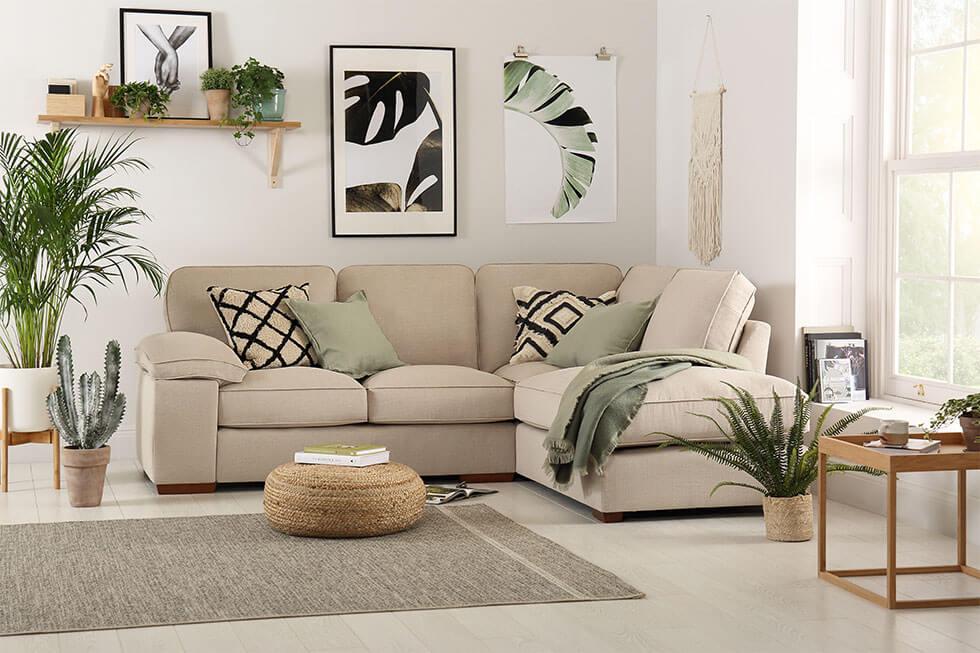
Taking design cues from the cosy Scandi look, a neutral colour palette is an easy entry point to this trend. Soft, earthen shades like beige and taupe instill a tranquil, airy feel, making them ideal in smaller spaces and apartments.
Natural light is also a key player in brightening up your space. The living room and the home office can benefit enormously from this pairing of neutrals and sunlight, lowering your electricity bill while lifting your mood - a win-win.
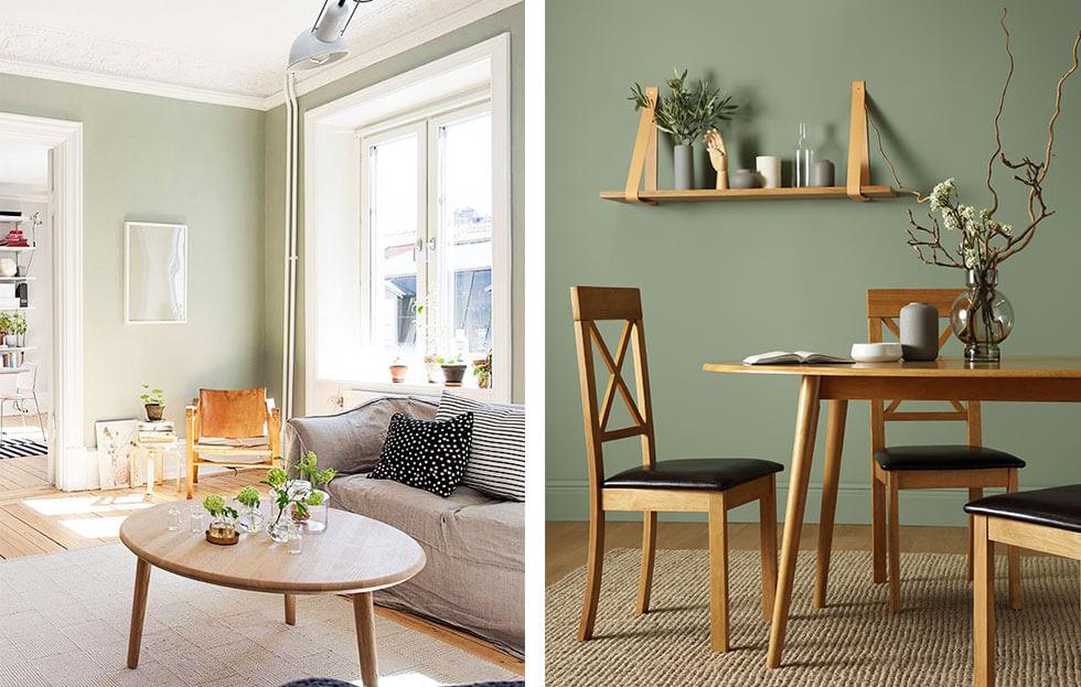
And for a cool neutral look that dances between classic and the unexpected, consider sage. This colour has achieved evergreen status for its fresh, versatile and undeniably calming qualities, and reflects a desire to unwind and reconnect with nature.
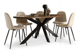
Sage’s chic and tranquil vibes can be styled in small and large doses, depending on your preference. It can work wonderfully as a backdrop to showcase statement furniture like a wooden dining set or bed, or as decorative accents in a neutral-themed living room.
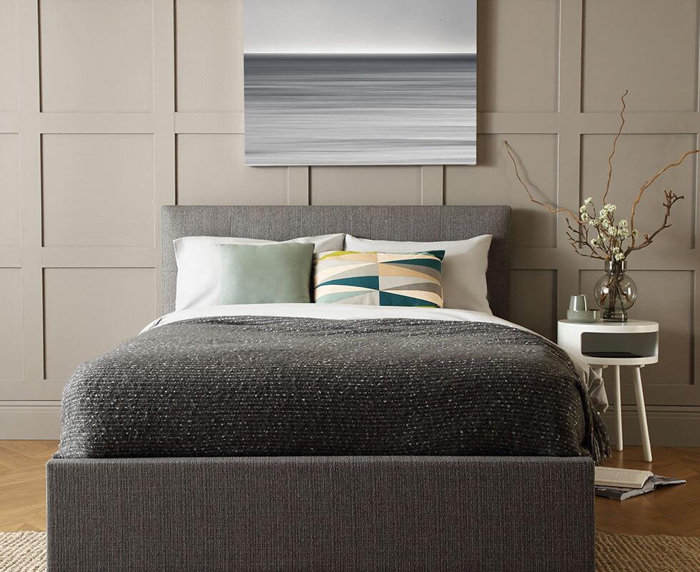
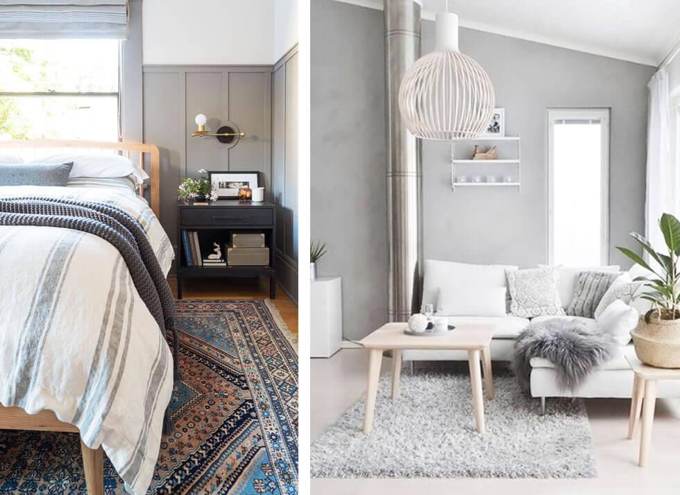
Another popular choice that can be adapted to various interior trends, grey has many faces - or dare we say, shades (maybe even fifty!). This in-between colour also has a calming, intimate feel, making it suitable for almost every part of the home, specifically the living area, study, and the bedroom.
Grey’s major advantage is its not-too dark and not-too-light position on the colour scale, providing cosiness to a space without being too bold and overwhelming. It also provides for some visual rest and respite in your space without being dull, while also providing a blank slate to showcase statement art or furniture.
For an element of shine, introduce metallic elements to a grey room or play up natural light in light grey spaces for a well-lit and welcoming interior.
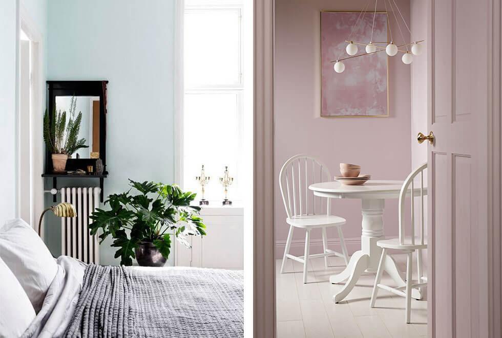
Their darker cousins go big on drama and glam at home, but light blues and purples are anything but. Their effect is more soothing and inviting, making these shades great choices in the bedroom for both adults and children.
Going with light azure tones - like sky blue and that lovely (and iconic!) shade of robin’s egg blue - offer a burst of personality while adhering to the softer side of the colour wheel: perfect for sleeping in and waking up to.
Alternatively, you can tap into Ultraviolet’s gentler side with a touch of mauve or lilac. These colours lean a little more towards grey, for a look that’s more modern and less childish. For a trendy approach, mauve can work as a neutral in living areas as well as the dining room for a pleasant pop of colour and an energising boost.
Bright Colours And Pastels
A tranquil interior with bright colours? Yes, please! Here are some other ways to scratch that colour itch, if you’re not one to shy away from bold hues.
Gentler, toned down shades offer lots of character in neutral-focused interiors, making them excellent choices for an accent colour or to highlight a special part of the room.
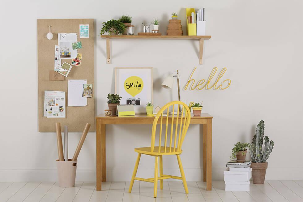
Take yellow for instance: it’s a sunny, summer-ready colour that can make a huge statement in large doses, but it offers the same levels of cheerfulness and zest as an accent shade. This vibrant colour pairs up well with a variety of hues, or acts as a delightful scene-stealer in a neutral room, as we did above with a bright yellow chair and this quirky coat rack from Block Design.
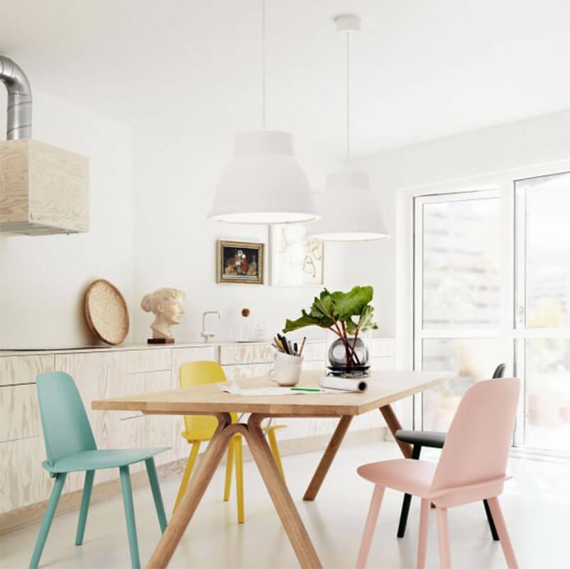
Another way to live your best colourful life through this trend is by going down the pastel route. These soft hues act as a calming presence in busy spots like the living room and kitchen, while also offering a cheerful dollop of personality to neutral spaces.
With pastels, a little goes a long way, so you can get creative with smaller elements like tableware, or opt for something bigger like dining chairs for visual contrast. Bonus: they’re also incredibly Instagrammable and will be a hot subject with guests.
There’s no right or wrong when it comes to creating a calm and relaxed space, most of it depends on your personal preference and take on wellness. So whether you opt for a minimal, Scandi home or a contemporary interior of sage or mauve - just keep calm and carry on!